Philippine Airlines
Philippine Airlines (PAL) serves as the official flag carrier of the Philippines, and has partnered with Young & Rubicam Philippines, a globally renowned digital agency. My role within this collaboration has entailed enhancing the Information Architecture of PAL's corporate website, with a view to improving the delivery of content, user experience, and adherence to established web standards.
My Role
As the UX Consultant, my main role was to make sure that the basics of UX and WCAG 2.0 guidelines are applied on each screen.
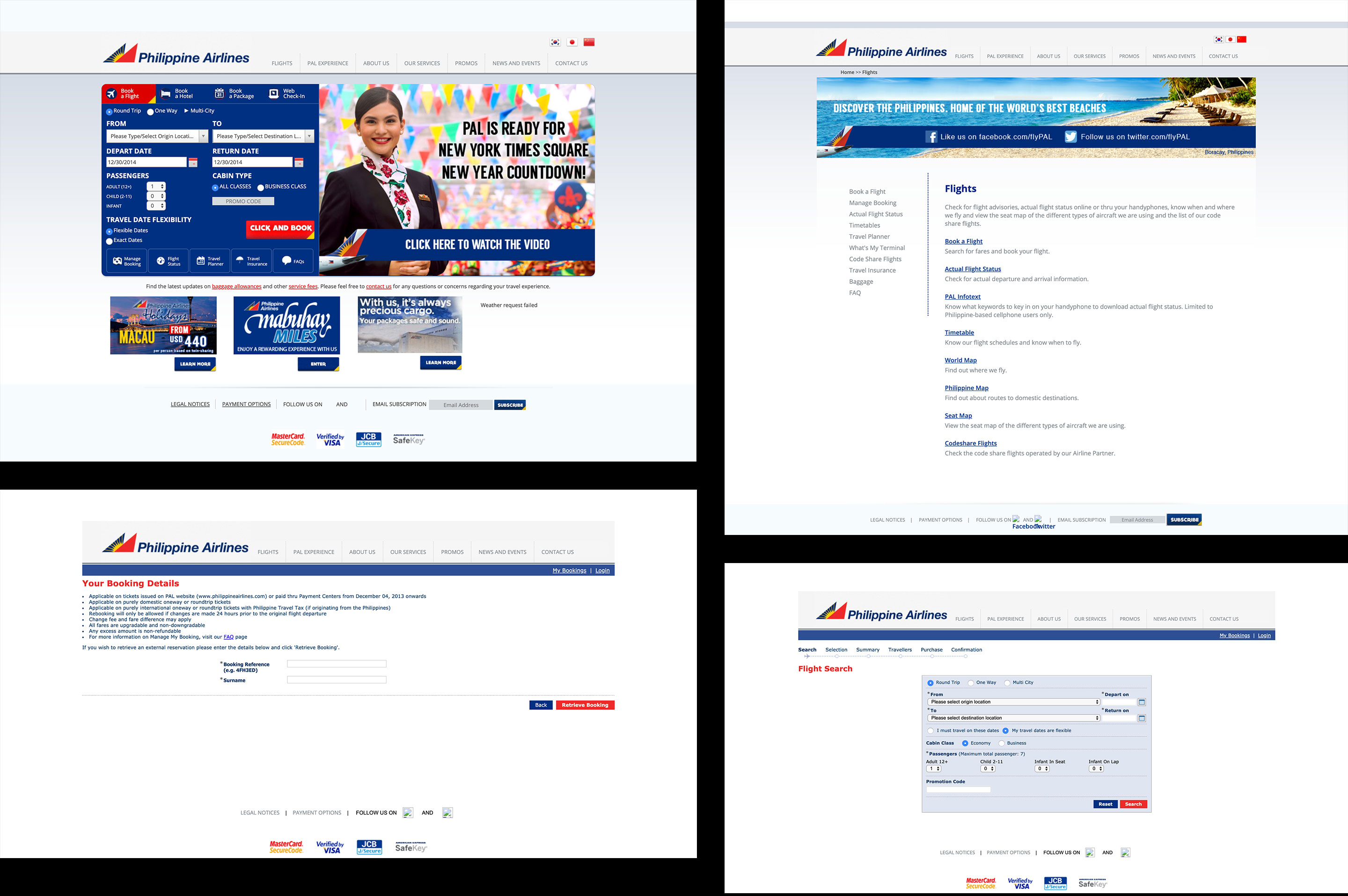
The Old Look
WCAG 2.0 Level AA
- Color contrast is, in most instances, at least 4.5:1
- Alt text or a similar solution is used for images that convey meaning
- Navigation elements are consistent throughout the site
- Form fields have accurate labels
- Status updates can be conveyed through a screen reader
- Headings are used in logical order
Remapping the Map
In an effort to establish a unified approach and consensus on next steps, we have opted to create a document to outline our objectives. The site flow analysis provided invaluable insight into the typical user journey on the site, allowing us to streamline the user experience by eliminating unnecessary steps. As a result, we have significantly improved the overall user journey.
Now that we have clarity, we’re on the move.
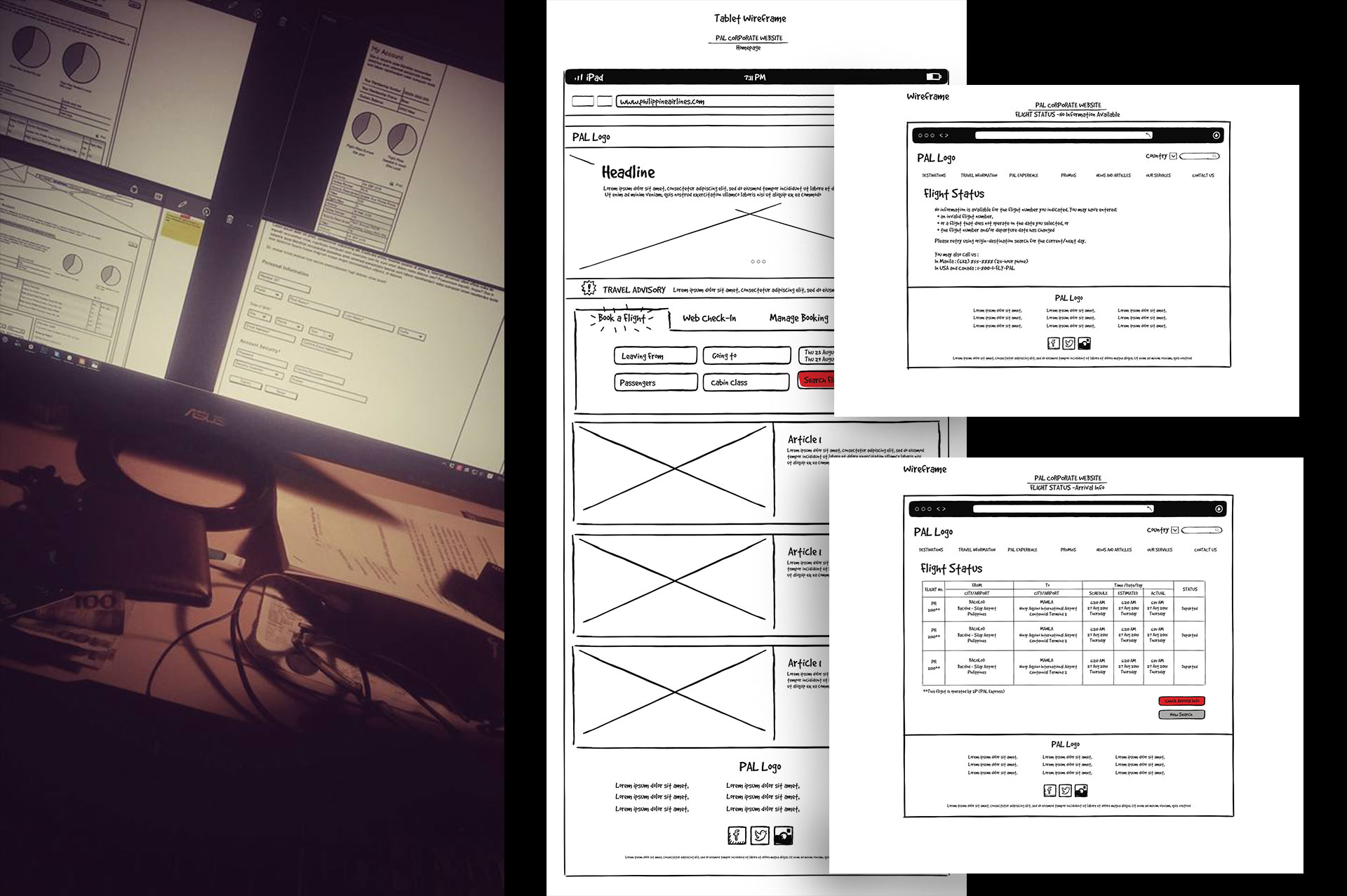
Framing ideas
20+ wireframe screens created that night. There were lots of call and alignments happened.
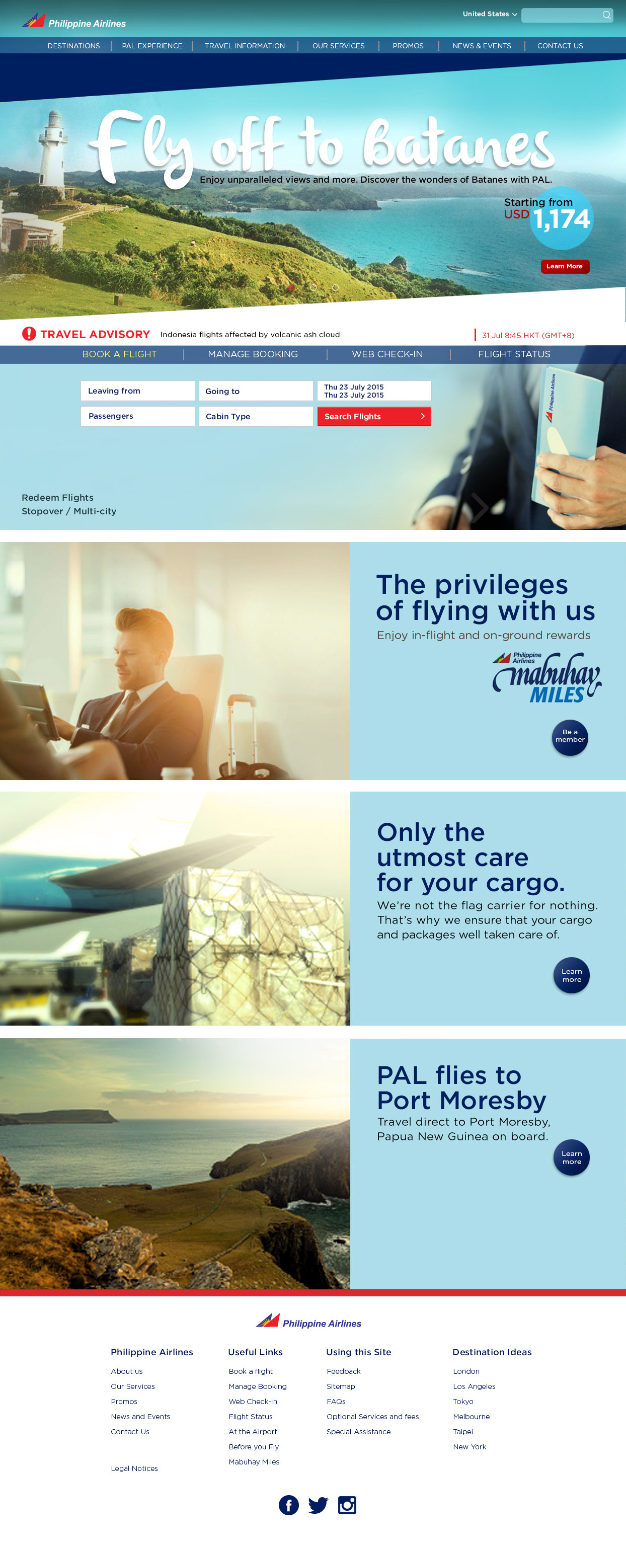
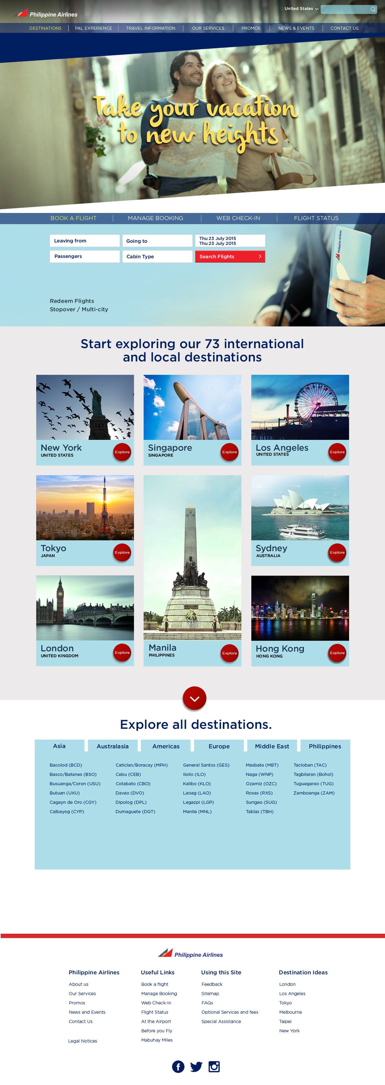
Final Designs
These are some of the final designs created by the team. There were fixes in the design that were pushed by the Accenture team to adapt to the CMS that they'll be using.